
The new scatter plot, sn-scatter-plot, has reached its finalized form a week ago in Qlik OSS (Qlik Open Source Software). I joined this project since my first day at Qlik, and its completion also marked the end of my first year with the company, talk about the fleeting of time! Together with other Qlik OSS projects, sn-scatter-plot is Qlik’s effort to give external developers and enterprises a more flexible way to build and integrate visualizations on top of Qlik’s products.
Scatter plot basics
As its name suggests, the scatter plot uses scattered dots or bubbles on an xy plane to show the relation between two measures of a list of objects. Think about a group of students whose weights and heights we wish to investigate. Each student can be drawn as a dot labeled by the student’s name. The dot’s x coordinate is the student’s weight and y coordinate is their height. The relation between heights and weights if any will be revealed on the scatter plot. As a side note, in the above example, name is called dimension and width or height is called measure of our data. The scatter plot represent values of two measures over a dimension. A third measure can be added, by using the size of the bubble.
Cool features
Animations
Scatter plot is the first Qlik OSS chart has animations in place, giving a smoother feeling when a new selection of dots has been made, or when the chart is resized.
Navigation panel
A navigation panel can be turned on to make browsing chart easier. The navigation panel include pan buttons, zoom buttons, and a home button. They were built using React and Material UI.
Binned data
One of the competitive features of Qlik’s products is the ability to deal with massive data set (tables with millions of rows). Therefore, it is anticipated that a scatter plot can have millions of dots, which may cause lagging when interacting with the chart, especially on mobiles. To solve this, the data points can be grouped into rectangular bins. When zoomed in enough, the separate data points will appear from within the bins. Additionally, an interactive mini map and home button will be shown if all the bins do not fit into the view any more after some pannings or zoomings.
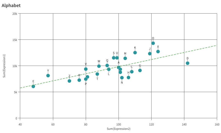
Best fit lines
Best fit lines are remarkably useful tools to discover trends in your data. The new scatter plot support a wide variety of trend line types: average (zeroth degree), linear (first degree), second degree polynomial, third degree polynomial, forth degree polynomial, exponential, logarithmic, and power. Below is an example of a linear trend line.
Plugins
As with many Qlik OSS charts, sn-scatter-plot support chart plugins. Plugins provide the possibility to modify charts from outside. A plugin can be passed into a scatter plot to add or modify its capability or visual appearance. The example below shows how a line component, which is not native to scatter plot, can be added to show more information in the chart. Prepare yourself for a little suprise!